Client Work
Before & After. Real pages. Real results.
Each project below shows the original page alongside the new page build, plus the thinking behind every decision. Most builds include copy, layout, graphic editing, and full technical setup.
Outdoorwarranty Page
Lead Magnet · Full Redesign
The original page had no clear offer or standout value proposition — visitors couldn’t quickly tell why they should choose this company over a competitor. I researched what genuinely set them apart (primarily cost savings), then rebuilt the entire page around that message.
What I Did
- Identified the company’s core USP — significant cost savings — and made it the centerpiece headline
- Rewrote all copy from scratch: headlines, section intros, and CTAs benefit-first
- Rebuilt into a CRO-focused layout with a strong above-the-fold section
- Added a form with 3rd-party integration including Discord lead notifications
- Used customer testimonials to anchor a dedicated support section — proof behind the claim
- Replaced generic van vector graphics with real, contextual photography
- Built and connected all supporting pages and templates behind the scenes


Relentless Roofing Company
Service Business · Full Redesign
The original site had no clear structure — visitors couldn’t quickly identify who this company was, what they specialized in, or why they should trust them. The rebuild gave every section a clear job: communicate, differentiate, and convert.
What I Did
- Hero section now immediately communicates who they are, what they do, and what sets them apart
- Wrote copy that highlights their asphalt and shingle specialization — a genuine differentiator few can claim
- Added a comparison table to position them clearly against competitors
- Insurance claims and storm damage addressed directly with dedicated headlines
- Credibility badges added to the form section; testimonials with photos throughout
- All CTAs open a popup — no page-abandonment redirect
- Added an owner mission/vision section to humanize the brand
- Graphic-enhanced client photos — originals were often washed out


Dr. Jeff — Dosae™ Method
Medical / Healthcare · Lead Magnet Rebuild
Dr. Jeff’s original Wix page introduced his patented Dosae™ back pain method, but dense medical language and a weak structure buried the offer. I rebuilt it in WordPress as a conversion-focused lead magnet — clearer, more readable, and designed to move visitors into a form.
What I Did
- Handled copy, design, build, image editing, and funnel/form setup end to end
- Hero section completely rebuilt: attention-grabbing headline + integrated multi-step quiz form
- Translated heavy medical terminology into plain-language benefits patients could understand
- Broke down key facts into scannable sections and card layouts instead of walls of text
- Added credibility-building sections (credentials, patient outcomes, method explanation)
- Built multiple pages including a long-form variant and a video landing page


Airvida — Soft Shell Hyperbaric Chamber
E-commerce Product Page · Shopify
The existing product page was confusing — multiple purchase variations with identical-looking images and no clear way to compare them. I rebuilt the page to make the options understandable and the product far more compelling, while operating within Shopify’s constraints for variation names.
What I Did
- Added a comparison table to clearly distinguish between the purchase variants
- Added a tabbed table for visitors to switch between configurations at a glance
- Inserted a testimonial block on the hero — credibility signal not present in the original
- Created a dedicated section for the All-in-One Unit — their standout product that was being overlooked
- Elevated the testimonial section using credible named clients and businesses
- Added a Delivery & Setup section so visitors could visualize actually owning the product
- Improved the financing section with a popup for full details — no dead-end links
- Created 15+ custom hero slides summarizing the product benefits — done on my own initiative


Custom hero slides I created for this product


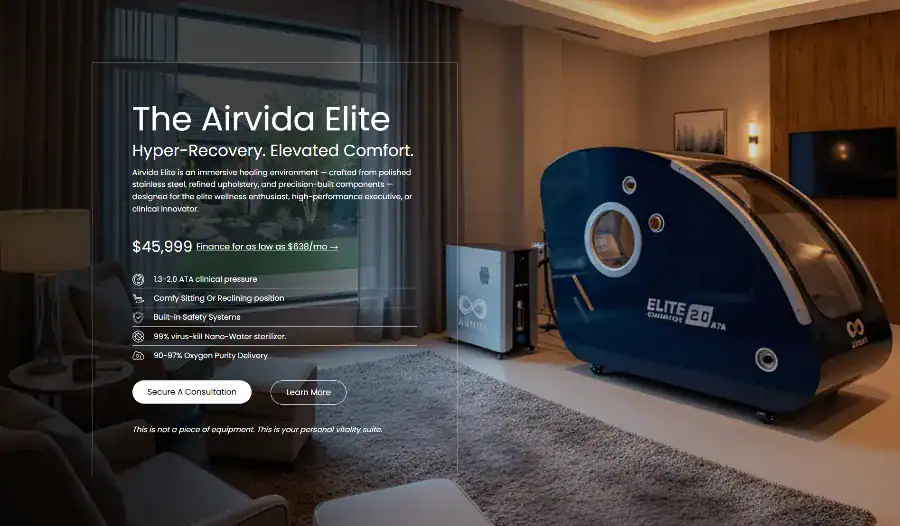
Airvida Elite — Hard Shell Hyperbaric Chamber
E-commerce Product Page · Shopify
The client had an existing product page, but it was bare-bones — no social proof, no context for business buyers, and no section for their standout All-in-One unit. The rebuild made every section earn its place and speak directly to who buys these chambers.
What I Did
- Improved product feature presentation — better visual hierarchy and benefit framing
- Added a “Get Client-Ready” section targeting wellness center owners and B2B buyers
- Gave the All-in-One Unit its own featured section — it was their most powerful product but had no spotlight
- Added a Delivery & Setup section so buyers could envision the product in their space
- Built a clear “What You’re Getting” section — fast summary for purchase-ready visitors
- Suggested and added credible named client testimonials — labeled by who they are, not just quotes
- Added more credibility sections with real client results and visual proof


Standing Red Light Therapy Booth
Product Page · From Scratch
The client was planning to sell a red light therapy standing booth and pointed me to the manufacturer’s page. I designed and built their own page from scratch — one that stood out visually while clearly communicating what makes the product worth its price.
What I Did
- Researched the product’s key differentiators and built the page structure around them
- Matched the color palette to the product aesthetic — dark background that complements the red light visual
- Also created a white-background version; client preferred the dark one
- Added a benefits carousel for quick scanning above the fold
- Gave each key feature its own section with a dedicated headline — doubles as SEO anchor text
- Added a “Premium Addition to Any Space” section aimed at business owners envisioning the booth in their wellness center


Additional Work
+ More Page Builds
Let’s Talk
Want your page to have a before and after?
I bring the same research-first, CRO-focused approach to every rebuild.