Sarah Coach before after
Gave AI the design assets and direction for a hero section of a coaching landing page.
What it produced:
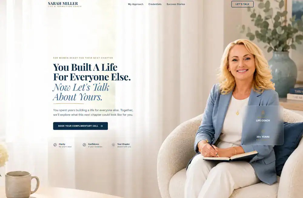
Result: It had too much space! The fonts are all over the place – small headline, the grid fonts below the button is too small, the floaty card is undreadable.
After several adjustments and tweaking…
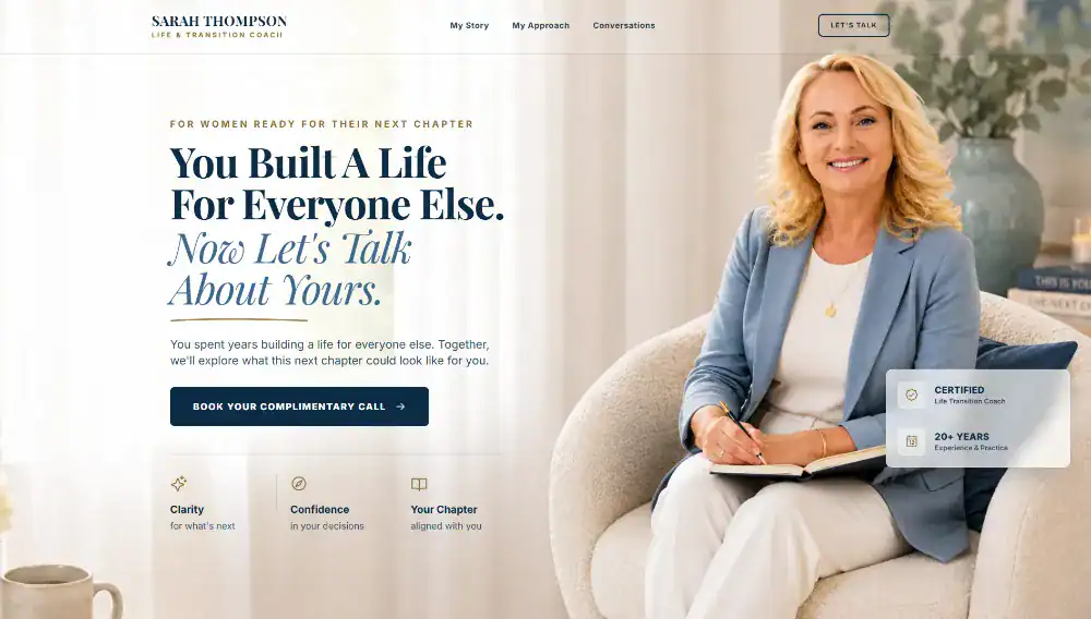
Much better and clearer!
- Bigger main headline
- Texts are now more readable
- Change the trust signal cards to highlight the certified and years experience… and made the entire thing more visible.
- Adjust the grid card below the cta to put icons on top rather than on the left for clarity and spacing.
- Overall spacing on the section is better!
See it as a live here.
#landingpage