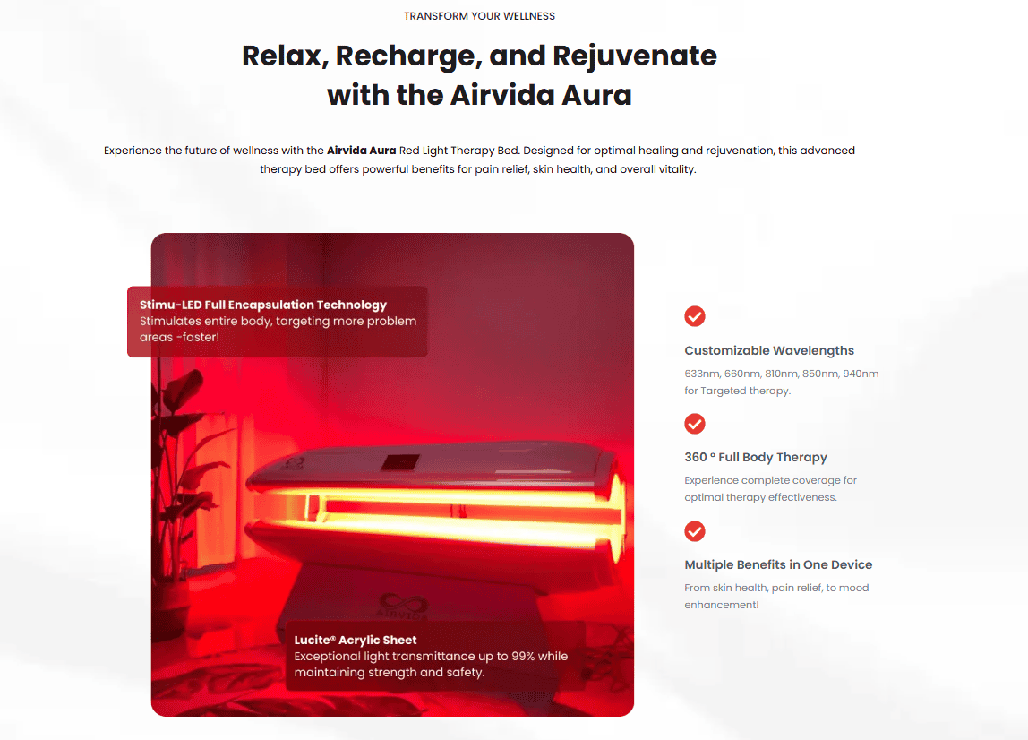
Before and Afters
Here are some past client works i’ve done. Most of the time, I would come up with the copy, design and even graphic creation, along with building the entire page (or site). Please see at the bottom for more page builds.
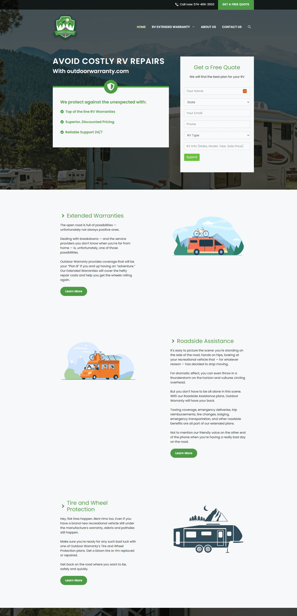
Outdoorwarranty Page
What the site is about:
Offers RV Warranties.
Transformed the page to be lead magnet.
The original page really didn’t communicate any ‘special offer’ well. After researching, I wrote down what made their service stand out, came up with the headlines and the rest of the copy and design.
Things I did/added/improved:
- Copy, design, behind the scenes builds (setting and building the other pages/templates/etc).
- Form integration.
- Find what makes the offer unique, add sections for it and improve headlines.
- Analyze and pick out the ‘stand out’ offerings – in this case i chose the ‘Cost Savings’ one could get if choosing the company.
- Carefully position the company as the go to choice by using them on the headlines on each section.
- Utilize testimonials to build out offer some sections (like a section on focusing on customer support backed by the testimonials).
What i didn’t do: Logo
Before
Roofing Company
What the site is about:
Relentless roofing is a company that does various roofing services in Michiana.
There wasn’t a clear structure on the original site in terms of the main offer.
With the transformation, there was a better strcuture, and with that better headlines, and with that we could highlight different propositions of the company and address customer’s pain points.
What I Did:
- Copy design and build as well as forms intergaration.
- Hero section communicates who they are, what they offer, what sets them apart.
- Usage of credibility badges on the form section.
- Because of the redesign, we could write better headlines and highlight their USPs and customer’s pain point – example was insurance claiming and storm damage.
- They were also specialist on asphalt and shingle roofing. So i made sure to put that since not many can say that.
- Added a comparison table – another opportunity to present why they are different and why they should choose the company.
- Visually, made sure to utilize the images of their client’s ‘new roofs’.
- Made sure to highlight some testimonials which had images.
- I also did some graphic enhancement on each image as the originals were sometimes ‘washed’.
- CTA Buttons would popup instead of being redirecting to another page.
Before

Spinal Disc Expert Page
What the site is about:
Dr. Jeff wanted to introduce patients to his patented Dosae ™ method for fixing back pain or one experiencing spinal aches/injuries.
The original page was made on wix, so there was a limitation in the visual design aspect. On wordpress, I transformed the page to be more of a lead magnet type of page.
What I Did:
- I did the copy design and build as well as forms/funnel design.
- Also did some image editing.
- There were several pages for this site I created Including a long form page.
- Currently, it is a video type landing page with a multi-step quiz form.
- I tried to put important facts into different sections, as well as sections to build credibility.
- Transformed beneficial point more ‘bulleted’ easy to read text and ‘cards’.
- Compared to the original page, it’s more easily readable and ‘understandable’.
- The challenge here was also understanding the method/practice itself as there were heavy medical terminologies used.
Before

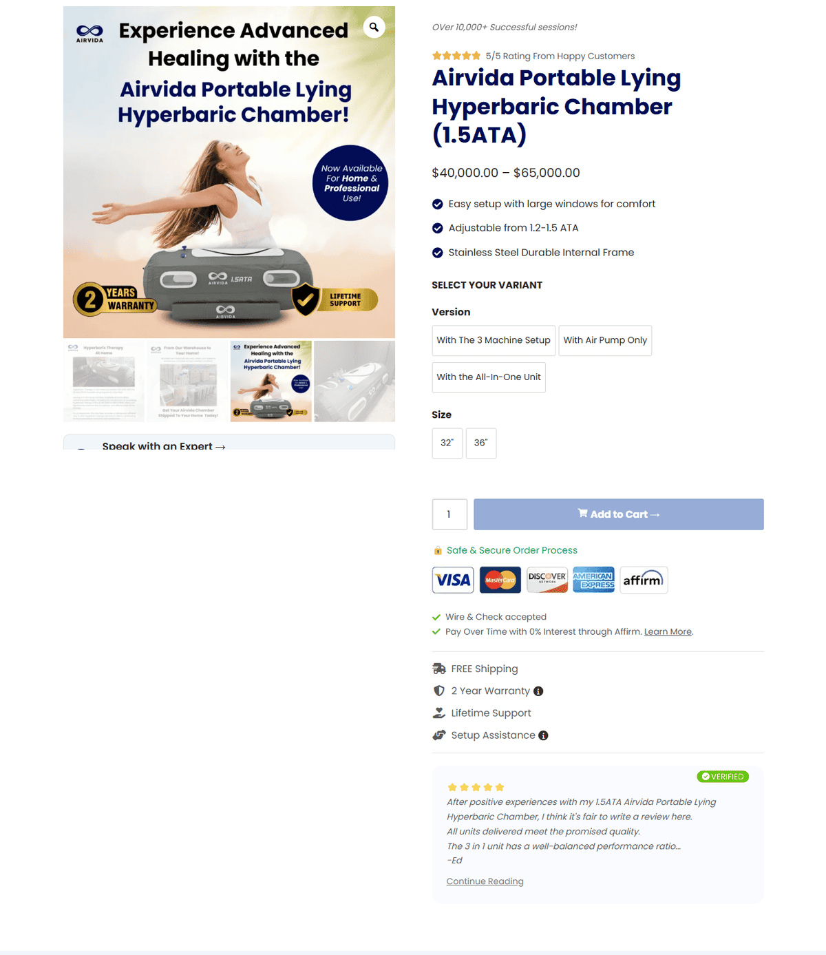
Oxygen Chamber 1 - Product Page
What the page is about:
A product page for a soft shell oxygen chamber (that can be used at home or commercially).
Most product page would typically have a price info and description section. The way i created it is to have multiple sections to showcase the product’s highlights.
What I Did:
The initial product page was a bit confusing for me as I was not familiar with the product space and there were multiple ‘offerings’ (different purchase options) they wanted to offer and the images looked the same (didn’t change when clicked).
One thing i did immediately was add a comparison table to help with this confusion. I also tried to offer to rename the variation titles, but this would be out of my control since their page was done in shopify.
Important sections/notes i did on the new page:
- Added comparison table to help distinguish between purchase variations.
- Added testimonial block on hero section, with a specific design and headline to build credibility and social proof. This was not present on the original page.
- Added a separate section for the unit that can power the entire system – the All in One Unit. I thought this was a star product but was not given a highlight originally.
- Improved testimonial section – suggested use any credible clients they had.
- Added testimonial block on the positive experience of previous customers (to help build brand crediblity).
- Suggested to improve the financing section. I made a popup so there will be more info on the financing details.
- Created a ‘tabbed’ table to help visitors distinguish between variations.
Before

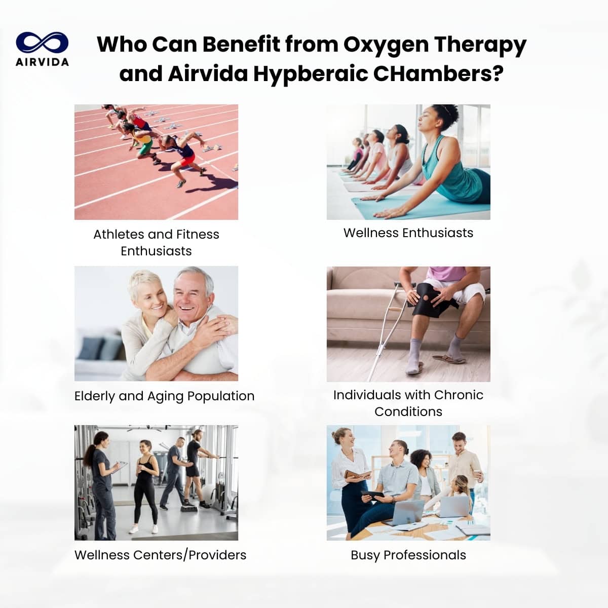
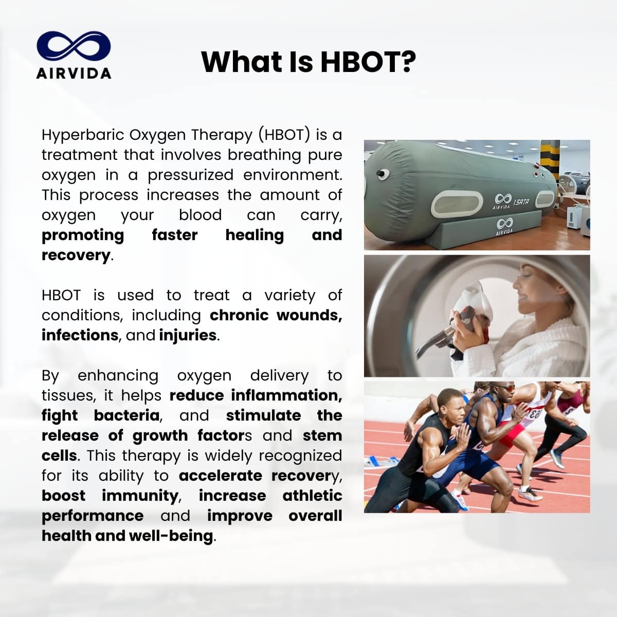
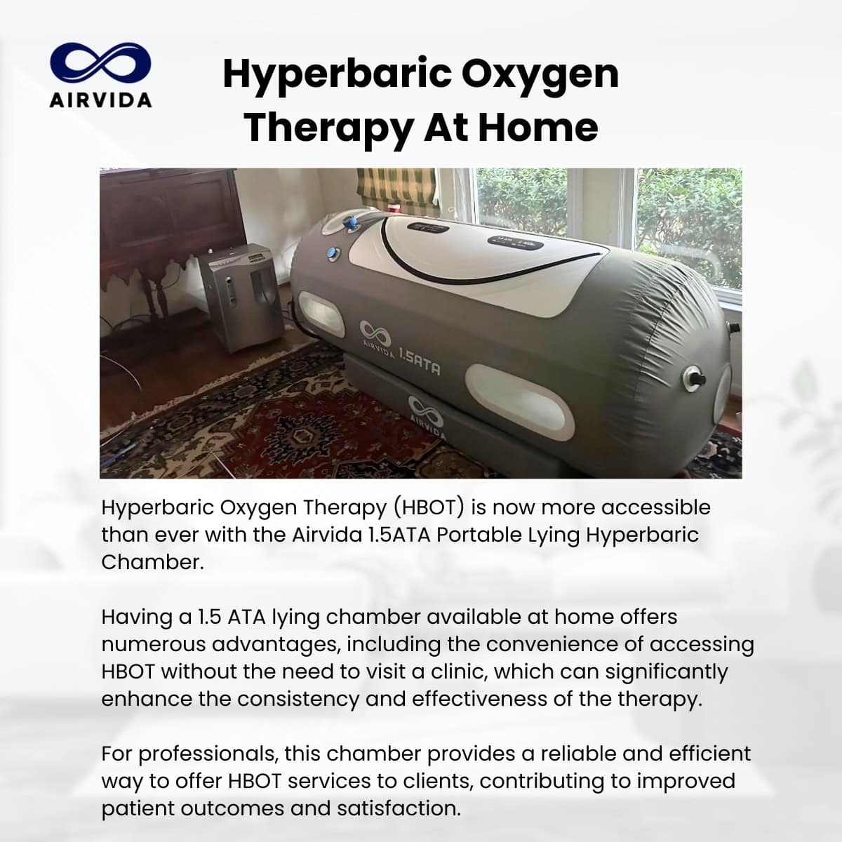
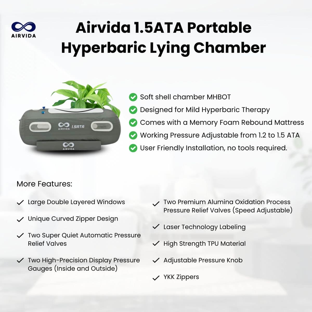
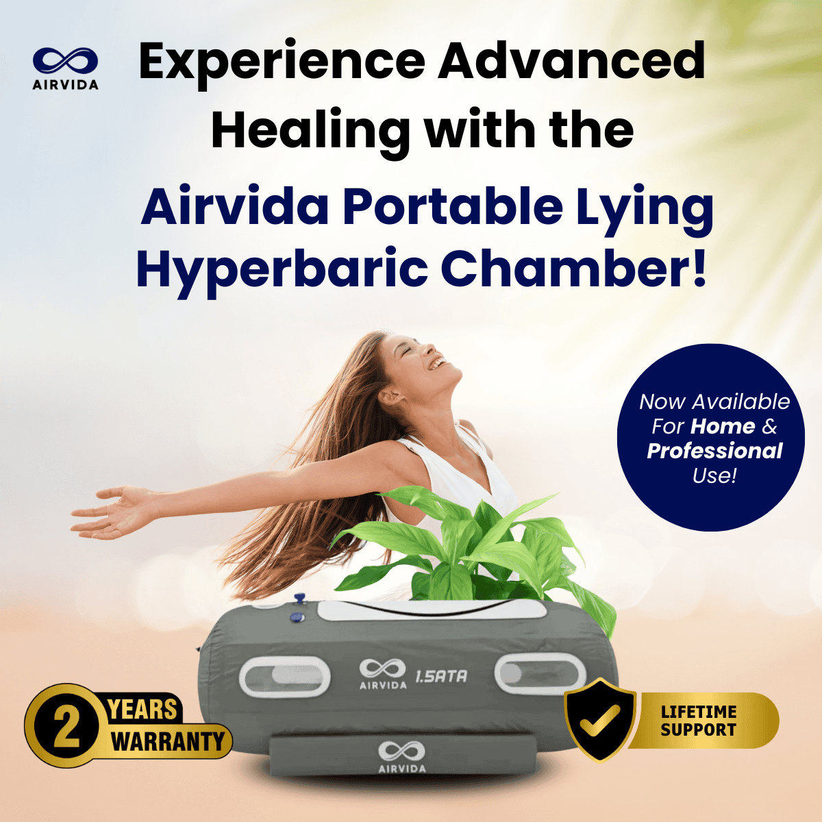
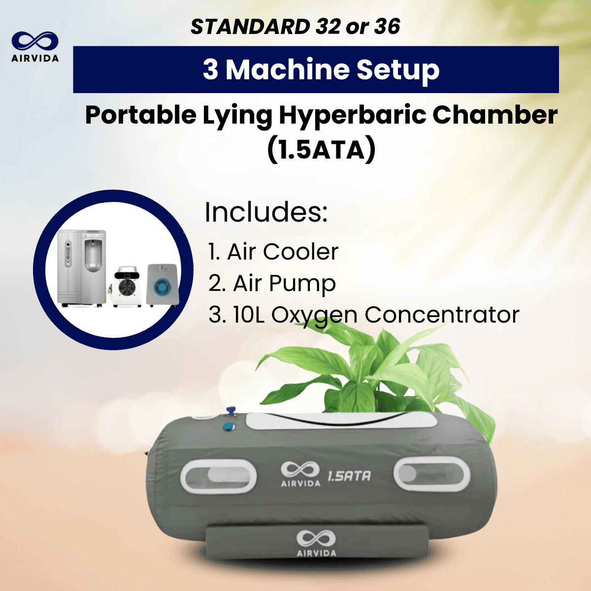
I also created some slides to accompany the page (under my own initiative). This would be used on the hero section’s thumbnail gallery. Since this would be the first visuals a visitor would see, it would be good to put a ‘summary’ or what the product is about/what it can do for them. I created around 15+ slides for this. Here are some of them.
Oxygen Chamber 2 - Product Page
What the site is about:
A product page for a hard shell oxygen chamber.
The client had an exisiting page but was very bare bones.
What I Did:
- Made the page really stand out, highlight the product features, testimonials and utilize visuals.
- Improved the product features presentation. (Opted out the benefits section as per client)
- I suggested we use a testimonial block of credible ‘clients/partners’ – and made sure to label who they were.
- Added a ‘Get Client-Ready’ section which aims to convey that the chambers can be used for businesses and establishments. This section did not exist originally but i thought it was a good bit to add since they had clients who use their chambers for their wellness centers.
- One of their unique equipment was the All-in-One unit, but was not featured originally. I created a section for it to show it’s value why it’s a powerful unit to have.
- I added a section on the ‘Delivery and Setup’ to allow visitors to envision owning their unit in their spaces.
- Added a section on ‘What the customers is getting’ – to clearly help visitors get a quick grasp of what they would be receiving.
- Added more section to build credibility of the company by utilizing testimonies of past clients.
- Because of the redesign, we can make better headlines that addressing pain points. Examples would be sections on storm damage/insurance claims.
- Visually, the page has numerous client results.
Before

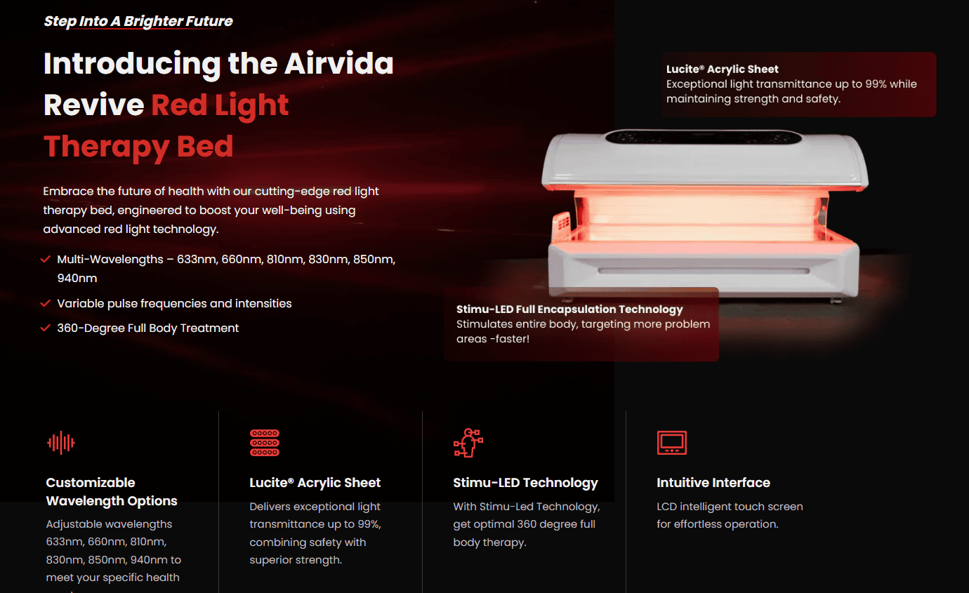
Standing Red Light Therapy Booth - Product Page
What the site is about:
A product page for a red light therapy ‘booth’.
The company was planning to sell the red therapy booth, showed me the manufacturer’s page, and wanted their own page for it.
So i designed and built the page that would stand out, at the same time highlight the product’s features.
What I Did:
- Researched what made this ‘product’ stand out.
- Made sure to highlight them.
- Used colors that matched the product.
- I also created a white-background version of this, and we settled with the dark one.
- Added a quick benefits carousel.
- Created different sections for each ‘feature’ highlight of the booth, doing it this way we could also utilize headlines.
- Section headlines would be either have the benefit or feature highlighted in pink.
- Added section ‘Premium addition to Enhance Any Space’ – to speak to business owners allowing them to ‘envision’ the booth in their establishment.
Before


